

Watch the Olympic Games anytime, anyplace with TIM’s Mobile app.
Designed a white label app as part of a collaboration between Eurosport and Telecom Italia. The app was available only to TIM customers who could broadcast live and on demand video coverage for the Tokyo 2020 Olympics.
Project: Mobile Broadcaster
Company: Eurosport/Telecom Italia
Sector: Sport / Broadcast Media
Role: Lead Designer
Duration: 1 year
Completed: 2020

Goals and Challenges
One of the goals of this project was to create app is to provide a wholesome experience to users of 24/7 Olympic content. The challenge was to create a seamless experience while including over 400 video content streaming on our backend which was a large stretch for our bandwidth.
To kick off, created a sitemap to create a hierarchy of the app, emphasised important take aways and constraints.
Product requirements:
Splash Screen
Authentication Message
Video Page
What’s on Schedule
Medal’s Page


User Testing Learnings
Conducted two rounds of testing. Recruited 5 candidates for each round who were sports fans and had some tech literacy between the ages of 30-55.


Round 1 Insights
Users were confused by the split screen live channels and were confused by the date order of content.
Top navigation tested poorly among many users, many were not able to identify the tabs at all.
My Sport (Favourites) tested well and many participants liked they could save and go back to a selected sport.
Round 2 Insights
Users could easily navigate between the top navigation (tab approach for latest and my sports sections).
24hr Live Channel was easily lost and only one user was able to locate it as it was too narrow and was easily lost between video cards.
Metadata and taxonomy was clear to users without being overwhelming.Users liked they could see sport pictograms, categories and live events.
User Interface Design
and Exploration
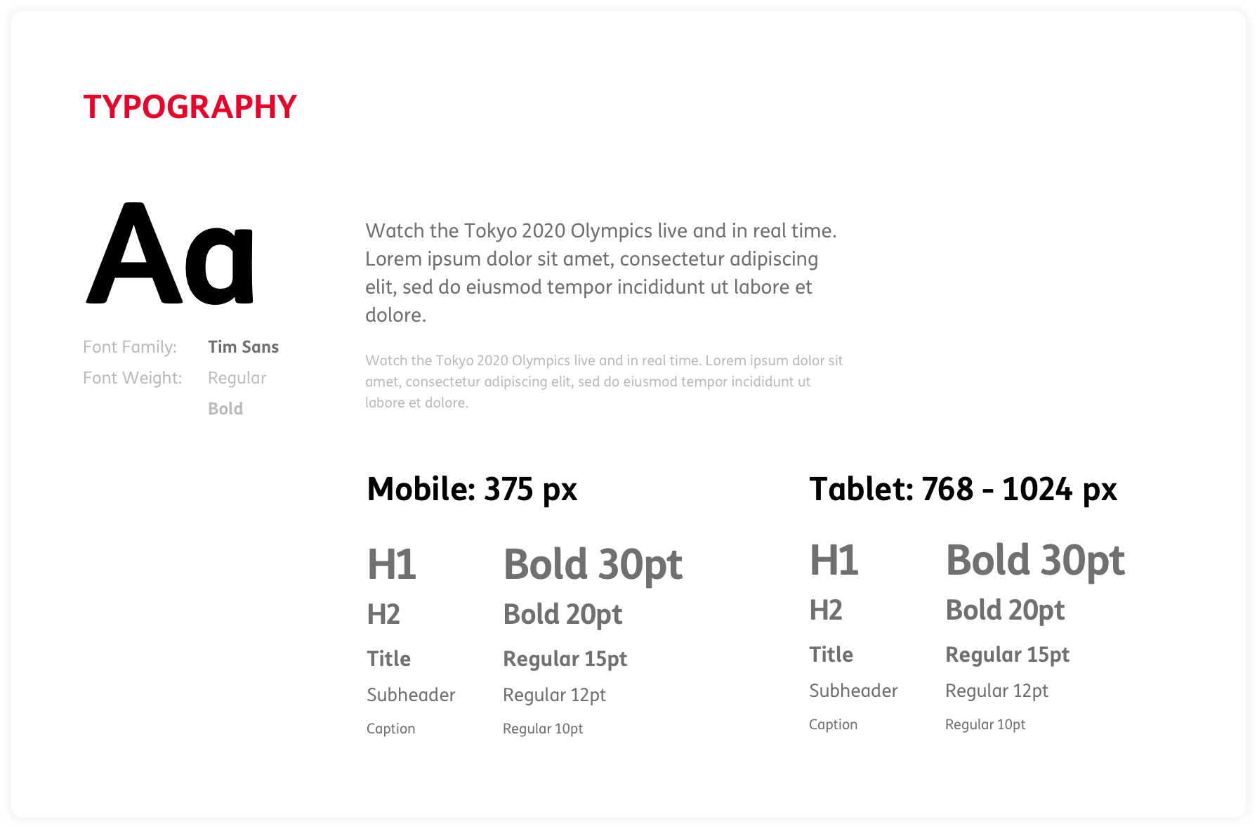
Following the user testing rounds and after learning key insights, I moved into the exploring UI elements. Based from Telecom Italia’s core brand colors, font and logo I created a toolkit, typeface guidelines, card templates, padding structure and more. Since this was a first of its kind app, I had the creative freedom to choose typography elements, card templates and more.


Once I defined the style guide, I was able to create high fidelity screens. Through out this process I was in simultaneous communication with the development team and created annotations for each feature to clearly map out its interactions as seen below.

Development Stages
Eurosport partnered with an external agency for the development of the native app. I oversaw and managed a team of developers to ensure the implementation of the designs. Made sure that correct behaviours and interactions were used through the different development stages.
Final Designs and Outcome
The app was successfully launched in IOS and Android devices in July 2021 with a record audience of 350K users in Italy.
